Flexbox —— 全能快速弹性布局方式
没有接触过flex的同学,请查看w3官方文档(中文版点这里)。
本文学习自该文档,是该文档的一份帮助学习博文
首先,flex出现之前,布局方式是怎么样的呢
CSS 2.1 定义了四种布局模式 - 由一个盒与其兄弟、祖先盒的关系决定其尺寸与位置的算法:
- 块布局 - 为了呈现文档而设计出来的布局模式
- 行内布局 - 为了呈现文本而设计出来的布局模式
- 表格布局 - 为了用格子呈现 2D 数据而设计出来的布局模式
- 定位布局 - 为了非常直接地定位元素而设计出来的布局模式,定位元素基本与其他元素毫无关
而flex出现,个人认为全新定义了一种灵活无比的布局方式,灵活到什么地步呢。大致就是,你想怎么样就可以怎么样。
flex
相对于 bfc ifc,flex也会创建一个 伸缩格式化上下文(flex formatting context)。
而这个伸缩容器内部的元素被称为伸缩项目,若伸缩项目内部不包含内容,这个伸缩项目不会被渲染
要搞懂flexbox,必须要有主轴与侧轴的概念!
引用w3官方文档中关于主轴与侧轴的图

1 2 3 4 5 6 7 8 9 10 11 12 13 14 15 16 17 18 19 20 21 22
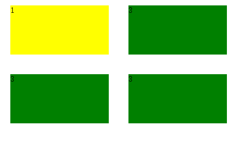
| <style type="text/css"> .flexContainer { display: flex; flex-flow:row wrap; flex-direction:row; } .flexContainer .child1{ flex:1; margin: 60px; background: yellow; } .flexContainer .child3{ flex:1; height: 100px; margin: 60px; background: green; } </style> <div class="flexContainer"> <div class="child1">1</div> <div class="child3">3</div> </div>
|

看到这里,细心的同学已经发现了,flex布局与block布局很明显的一个区别是,不会存在margin collapse
接下来依次介绍伸缩流布局的一些重要的属性
flex-direction
伸缩流方向
- row 水平方向排布,按照主轴start -> end的方向
- row-reverse 按照主轴end -> start 的方向
- column 垂直方向排布,按照侧轴start -> end方向
- column-reverse 垂直方向排布,按照侧轴end -> start方向
flex-wrap
伸缩行换行 - 控制容器是否换行,也决定了侧轴方向
- nowrap 不换行
- wrap 按照侧轴方向起点到终点
- wrap-reverse 按照侧轴方向终点到起点
除了nowrap以外的两个属性需要根据伸缩容器的flex-direction属性进行判断
如果flex-direction为row,则伸缩项目的总width超过伸缩容器的width时才会出现是否换行
如果flex-direction为column,则伸缩项目的总height超过伸缩容器的height时才会出现是否换行
伸缩项目没有启用flex属性,并且具有赋值的width,且伸缩项目的总宽大于伸缩容器的宽,才会开启换行模式
1 2 3 4 5 6 7 8 9 10 11 12 13 14 15 16 17 18 19 20 21 22 23 24 25 26 27 28
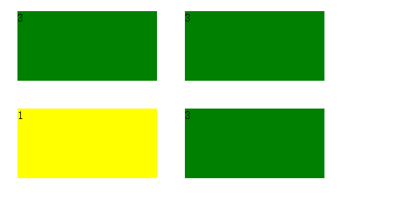
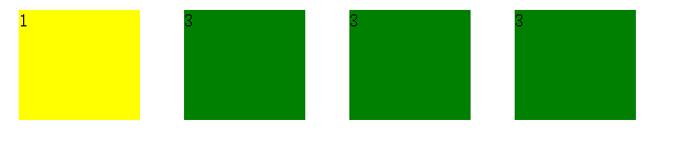
| <style type="text/css"> body{ width: 600px; } .flexContainer { display: flex; flex-flow: wrap; flex-direction:row; } .flexContainer .child1{ width: 200px; margin: 20px; background: yellow; } .flexContainer .child3{ width: 200px; height: 100px; margin: 20px; background: green; } </style> </head> <div class="flexContainer"> <div class="child1">1</div> <div class="child3">3</div> <div class="child3">3</div> <div class="child3">3</div> </div>
|
此处采用wrap
还是上面的布局,此处flex-direction采用wrap-reverse
还是上面的布局,此处flex-direction采用nowrap
从上面的例子可以得出 flex-direction 如果为nowrap,则你的布局会表现出伸缩项目宽度与容器宽度成比例的状态
flex-flow
伸缩方向与换行
flex-flow是伸缩方向与换行的一个合写,你可以继续使用之前两个属性也可以用该属性代替
1 2 3 4 5 6 7 8 9 10 11 12 13 14 15 16 17 18 19 20 21 22
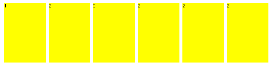
| <style type="text/css"> .container{ display: flex; flex-flow:row nowrap; } .container div{ width: 400px; height: 200px; background: yellow; margin:5px } </style> <div class="container"> <div> 1 </div> <div>2</div> <div>2</div> <div>2</div> <div>2</div> <div>2</div> </div>
|
order顺序
1 2 3 4 5 6 7 8 9 10 11 12 13 14 15 16 17 18 19 20 21 22
| <style type="text/css"> .container{ display: flex; flex-flow:row nowrap; } .container div{ width: 30px; height: 30px; background: yellow; margin:5px } </style> <div class="container"> <div style="order:6"> 1 </div> <div style="order:5">2</div> <div style="order:4">3</div> <div style="order:3">4</div> <div style="order:2">5</div> <div style="order:1">6</div> </div>
|
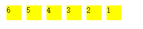
由这个例子可知
flex提供了一种全新的思路
元素排列的顺序可以完全不依靠文档的上下文,我认为这是flex其中一个很靓的点
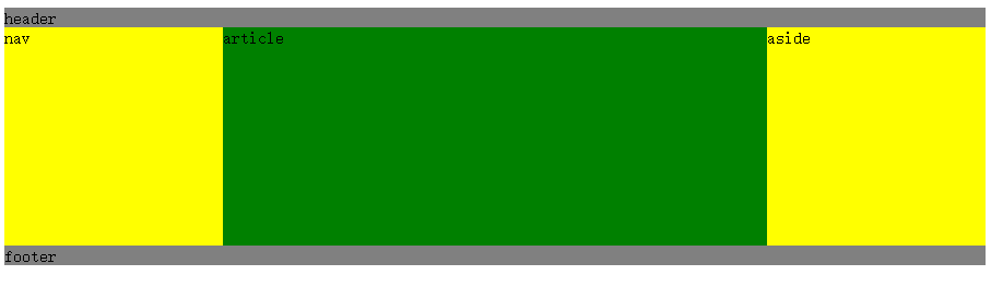
圣杯布局
圣杯布局一直是web很流行的一个布局,我们来对比传统方式和flex方式的圣杯布局
flex方式
1 2 3 4 5 6 7 8 9 10 11 12 13 14 15 16 17 18 19 20 21 22 23 24 25
| <style type="text/css"> header,footer{ background: gray } #main{ display: flex; flex-direction:row; } #main nav,#main aside{ width: 200px; background: yellow } #main article{ flex:1; height: 200px; background: green } </style> <header>header</header> <div id="main"> <nav>nav</nav> <article>article</article> <aside>aside</aside> </div> <footer>footer</footer>
|
传统方式
1 2 3 4 5 6 7 8 9 10 11 12 13 14 15 16 17 18
| <style type="text/css"> div:not(#main){ background: gray } #main div{ float: left; width: 33.33%; height:100px; background: yellow; } </style> <div>header</div> <div id="main"> <div>nav</div> <div>article</div> <div>aside</div> </div> <div>footer</div>
|
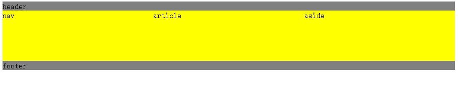
对比两种方式发现
- 传统方式的盒模型结构在处理百分比宽度与margin,padding的时候会显得比较笨拙
- 很难处理多列之间固定宽度与百分比宽度的融合
而flex这处理这一问题的时候,以非常灵活的姿态,轻松搞定各种布局难题,我称之为神奇的布局方式
flex:auto
我们在使用flex的wrap进行布局的时候,往往会碰到伸缩项目的总宽度达不到伸缩容器的宽度,而留空
这时候,我们可以使用下flexAuto这个属性,完美解决这个问题
1 2 3 4 5 6 7 8 9 10 11 12 13 14 15 16 17 18 19
| <style type="text/css"> #main{ display: flex; width: 300px; flex-flow:row wrap; border: 1px solid #eee; } #main div{ width: 80px; flex:auto; background: yellow; } </style> <div id="main"> <div>1</div> <div>2</div> <div>3</div> <div>4</div> </div>
|
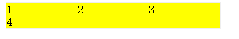
如上这个例子,我每个盒子本来宽度应该是80,3*80=240,存在空位,如果采用flex:auto后,则会自动平分空位,填满伸缩容器
flex
flex 由[ <’flex-grow’> <’flex-shrink’>? || <’flex-basis’> ]三个值组合
分别代表 扩展比率、收缩比率,以及伸缩基准值
flex-grow
取值:number
初始:0
用来设置伸缩项目扩展比
1 2 3 4 5 6 7 8 9 10 11 12 13 14 15
| <style type="text/css"> #main { display: flex; } #main div { flex-grow:1; margin: 5px; background: yellow; } </style> <div id="main"> <div>1</div> <div>2</div> <div>2</div> </div>
|

1 2 3 4 5 6 7 8 9 10 11 12 13 14 15 16 17 18 19
| <style type="text/css"> #main{ display: flex; width: 300px; flex-flow:row wrap; border: 1px solid #eee; } #main div{ width: 80px; flex:auto; background: yellow; } </style> <div id="main"> <div>1</div> <div>2</div> <div>3</div> <div>4</div> </div>
|
如上这个例子,我每个盒子本来宽度应该是80,3*80=240,存在空位,如果采用flex:auto后,则会自动平分空位,填满伸缩容器
flex
flex 由[ <’flex-grow’> <’flex-shrink’>? || <’flex-basis’> ]三个值组合
分别代表 扩展比率、收缩比率,以及伸缩基准值
flex-grow
取值:number
初始:0
用来设置伸缩项目扩展比
1 2 3 4 5 6 7 8 9 10 11 12 13 14 15
| <style type="text/css"> #main { display: flex; } #main div { flex-grow:1; margin: 5px; background: yellow; } </style> <div id="main"> <div>1</div> <div>2</div> <div>2</div> </div>
|
flex-shrink
用来设置收缩比率,指当伸缩项目的总宽或总高超过伸缩容器的高宽的时候,以怎么样的方式进行伸缩
取值
默认 1
1 2 3 4 5 6 7 8 9 10 11 12 13 14 15 16 17 18 19 20 21 22 23 24 25 26
| <style> body{margin: 0} #container{ width: 100px; display: flex; flex-direction:row; } #container div { height: 200px; width: 60px; } #test1 { background-color: blue; flex-shrink: 1;
} #test2 { background-color: yellow; flex-shrink: 0.5;
} </style> <div id="container"> <div id="test1"></div> <div id="test2"></div> </div>
|
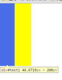
此处 flex-shrink的计算公式:
最后实际的宽度 = 期望的宽度 - 超出的宽度*shrink占总shrink的比例
test1Width = 60 - 20*1/(1+0.5)=47px;
test2Width = 60 - 20*0.5/(1+0.5)=53px;
flex-basis
取值
1 2 3 4 5 6 7 8 9 10 11 12 13 14 15 16 17 18 19 20 21 22 23 24 25 26
| <style> body{margin: 0} #container{ width: 100px; display: flex; flex-direction:row; } #container div { height: 200px; width: 60px; } #test1 { background-color: blue; flex-basis: 100px;
} #test2 { background-color: yellow; flex-basis: 100px; }
</style> <div id="container"> <div id="test1"></div> <div id="test2"></div> </div>
|
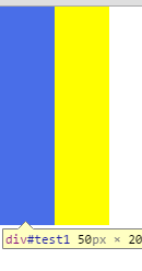
flex-basis是期望的宽高,最终会按照他的一个比例进行分配实际宽高,在这个例子就是100px/100%=1:1,即每个伸缩项目的宽度占伸缩容器的一半,50px
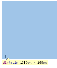
对齐
flex 中同样也支持margin属性,同时他变得更加强大,如果该值为auto则为反方向置顶
1 2 3 4 5 6 7 8 9 10 11 12
| <style type="text/css"> #main{ display: flex; height: 200px; } #main div{ margin-top: auto; } </style> <div id="main"> <div>11</div> </div>
|
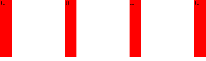
justify-content
主轴对齐
- flex-start 从起点开始
- flex-end 从终点开始
- center 主轴居中
- space-between
- space-around
space-between与space-around之间,我们举个栗子来理清楚
1 2 3 4 5 6 7 8 9 10 11 12 13 14 15 16 17 18
| <style type="text/css"> #main{ display: flex; height: 200px; justify-content:space-between; } #main div{ width: 40px; background: red; margin: 10px; } </style> <div id="main"> <div>11</div> <div>11</div> <div>11</div> <div>11</div> </div>
|
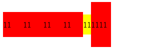
布局不变,我们修改justify-content属性为space-around
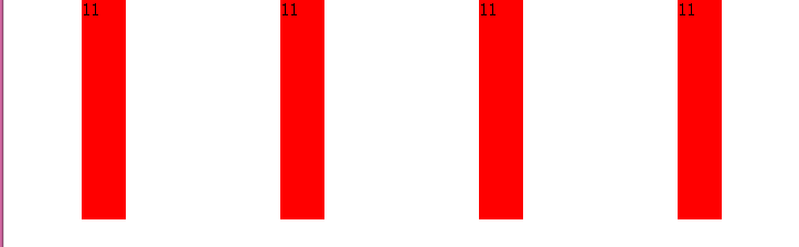
口以看明白
between属性将最边上两个伸缩项目的空白区域去除了,然后剩下的项目空白之间等距
around属性是将所有伸缩项目之间空白区域等距
侧轴对齐
侧轴对齐由两个属性组合决定
align-items
* flex-start 侧轴起点
* flex-end 侧轴终点
* center 侧轴中心
* baseline 侧轴起点
* stretch 占满整个伸缩容器
align-self
* auto 使用伸缩容器的align-items
* flex-start 侧轴起点
* flex-end 侧轴终点
* center 侧轴中心
* baseline
* stretch 占满整个伸缩容器
align-items是用于伸缩容器的,而align-self是用于伸缩项目,如果align-self的值不为auto,则采用align-self的属性,否则使用伸缩容器的align-items属性
这个地方要做一个比较 “baseline”与”flex-start”
首先是”align-items”为”baseline”属性的
1 2 3 4 5 6 7 8 9 10 11 12 13 14 15 16 17 18 19 20 21 22 23 24 25 26
| <style type="text/css"> #main{ display: flex; height: 200px; align-items:baseline; } #main div{ width: 40px; line-height: 50px; background: red; margin: 0; } #main p{ line-height: 40px; background: yellow; margin: 0; } </style> <div id="main"> <div>11</div> <div>11</div> <div>11</div> <div>11</div> <p>11</p> <div style="line-height:90px;">1111</div> </div>
|
“align-items”为”flex-start”属性的
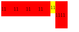
经过对比二者区分应该很明显吧,我就不做过多解释了
flex的baseline
根据上面的栗子,我认为flex的baseline应该是排序后line-height最大值的伸缩项目的baseline
既然flex如此如此好 ,那他有什么缺点吗?
最大的一个问题是兼容!!!
一张引自mozilla官方文档的图片
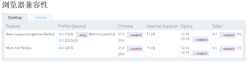
关于兼容的问题可以学习大漠的文章《使用Flexbox:新旧语法混用实现最佳浏览器兼容》,本文不做展开介绍了。谢谢观看
